PROBLEM
A Taiwan-based startup, came up with an idea to create an eCommerce platform that provides an enhanced virtual shopping experience. Their vision was to reach out to the people and help them with an all-inclusive e-commerce platform to get a hassle-free experience with an iOS app.
- Low Adoption rate of website
- Outdated website wtih limited options
- Poor communication strategy
- No applications for mobile users
CHALLENGES
- Product Sorting and Filtering
- Mobile payment and shopping cart integration
- Device compatibility for existing and next generation devices
- Deliver unified user experience
The solution should have an intuitive user interface with added features like user management, product listing, product search with shopping cart and one-click payment integration. The application must run flawlessly on various iOS based devices and smart-phones and deliver a unified shopping experience.
Our Approach
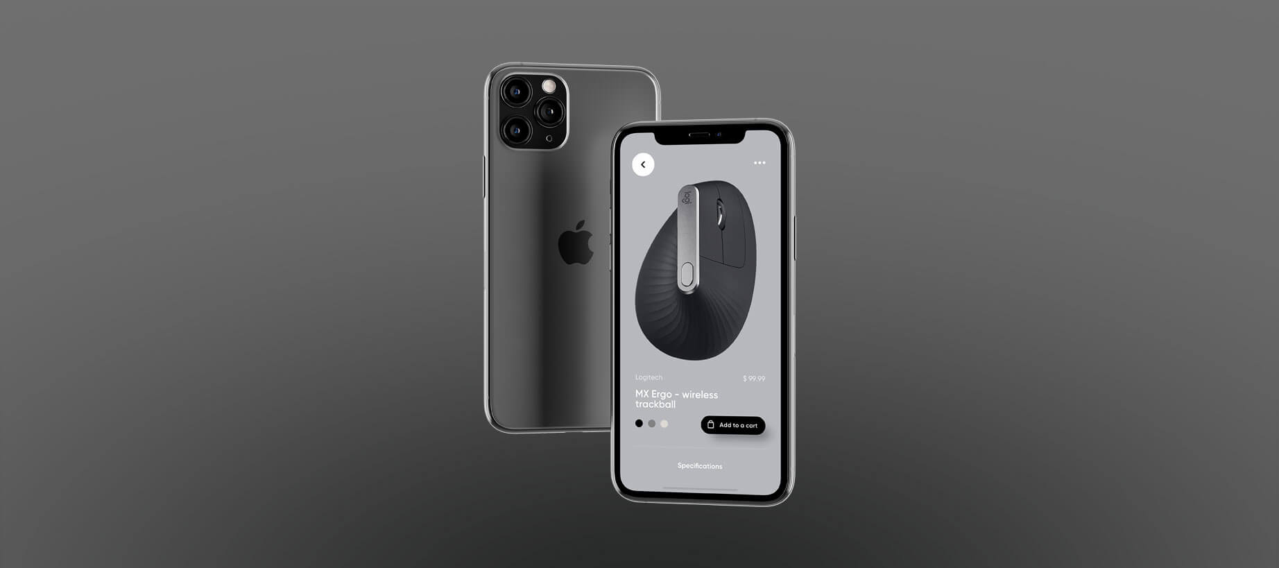
We focused on building a native application for iOS platform to deliver product categorization, product search, user management and providing inventory visibility to the retailers.
The iOS app was built using many reusable components like custom views, navigation control and app sync functions for rapid application development. Also, many branding and marketing functionalities were added to the app like location based messaging, notifications and social media integration as a part of multichannel user experience.
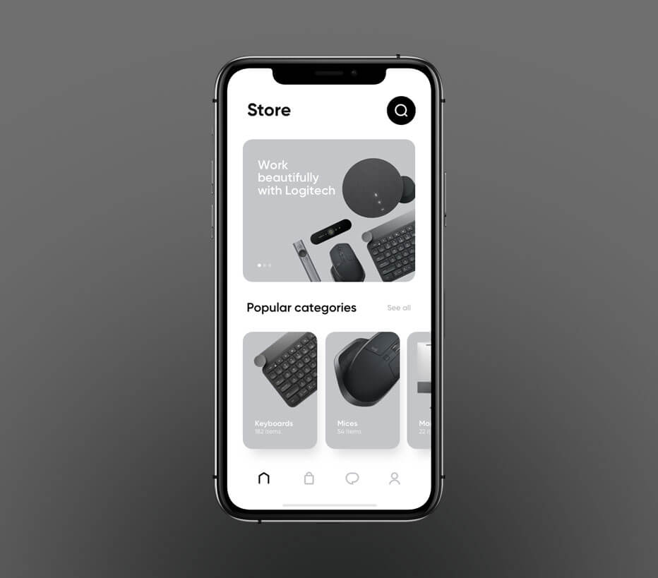
Home Screen & Categories
The home screen is where the user can opt to look at what items are on sale, search by gender, or season. We decided to not show the prices right away in order to not get the users distracted by that so they can focus on the categories they’re shopping for.
In the categories, the user can choose what kind of product he wants to see. For both men, women or children. There are a few in-depth specifications to help the user get closer to what he wants.
Single Product
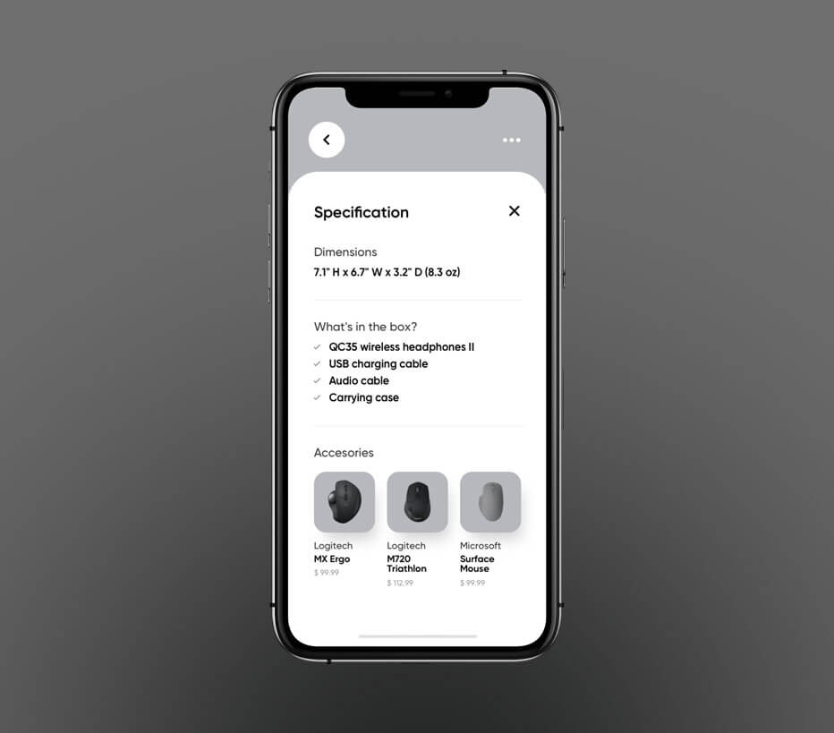
We designed the product’s page in a way that the user has to want to see similar items, nothing is pushed to his view, if the user is not 100% satisfied with the first product he chose, the user can scroll down to the bottom of the page and see the suggestions.
Keeping the suggestions too explicit may get in the way of what the user wants, making the user lose interest or get annoyed with the app.
This also helps the user to not spend an enormous amount of time in the app. Presenting suggestions it’s an important thing and we want the user to use the app, but we believe that if we can facilitate the main objective, the user will leave happy with a good experience and will come back for more.


Shopping Bag, History & Favorites
A very common and useful feature, Shopping Bag / Cart. Here is where the user can see all of the items he has selected and wants to buy. The user can either add more numbers of the same product or remove them.
Here is where things start to get a little different, the Favorites screen shows all the items the user has saved. The user has an option to sort the items by recently/last added, brand’s names or through prices. The items can also be added to the bag in this screen.
History Screen shows a horizontal slider of most recent orders. Users seem to not refer to very old orders. So, only orders of current year is shown in the slider items.

RESULTS
A user experience analysis is about determining if a product fulfills the needs of the users. Therefore, you’ll need to set sights on user research and not the other fancy features in the app. If the users are not happy with the app, they are unlikely to buy regardless of the creative efforts in it.
After the app was complete we realized a new survey to receive a final feedback. The thing that got the most interest in users was the practicality of navigating through the app.
- Excellent online ecommerce store
- Website wtih extensive search options
- New & improved communication strategy
- iOS application published in App Store
ROI
783%
CUSTOMERS
132,038
DOWNLOADS
60,200+
Copyright © 2023-25 QuantumParadox Studio

